EIRO
client
Jonathan
type of client
Artisanal & Handmade Goods
category
brand identity, digital collateral, printed collateral
brief
Create a name, messaging, and identity for a new brand of pure natural incense with the goal of transforming how individuals perceive incense. The aim is to position the brand as a trusted, premium choice that elevates daily rituals and enhances well-being. Through thoughtful design and a strong narrative, we will reshape the way people connect with incense, emphasizing its natural purity and ability to bring moments of calm and reflection into modern life.
what I did
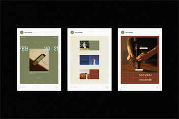
Eiro is a brand designed to evoke serenity and simplicity, encouraging users to slow down and appreciate the small moments while enjoying the calming effects of natural incense. The logo incorporates elements of incense and the gentle curl of smoke, symbolizing relaxation and mindfulness. The overall aesthetic promotes tranquility and a deep connection to nature, with deep, grounded colors conveying calm, while bold accent colors complement each scent, brightening and uplifting the experience. The minimal, professional packaging reflects the brand’s clean, authentic aesthetic, ensuring quick visual appeal and communicating the high quality and purity of the product.


